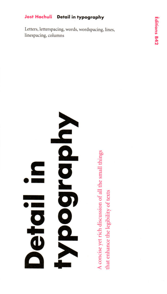
Jost Hochuli: Detail in Typography
Letters, Letterspacing, Words, Wordspacing, Lines, Linespacing, Columns
An attractive, interesting layout can certainly attract and please the reader; but when the details are not good, reading requires more effort and any pleasure is short-lived. ‘Detail in typography’ is a concise and close-up view of the subject – letters, words, the line, and the space around the elements – and it discusses what is essential for the legibility of the text. Yet this is more than a guide to correct typography. How is it, Hochuli asks, that text can be set perfectly and yet look insufferably dull? Answers may be found here, not least in the way the book itself has been set and produced. Jost Hochuli is a Swiss typographer, internationally renowned for his book design work. As a teacher, he has had long experience in Zurich and his home town of St. Gallen. As a writer and editor, his books include Book design in Switzerland (1993), Designing books (1996), and Jost Hochuli: Printed matter, mainly books (2002). He has edited and designed the annually published Typotron series of booklets (1983-1998) and the Editions Ostschweiz (from 2000).

